
10 YouTube Thumbnail Formulas That Actually Get Clicks
Proven YouTube thumbnail formulas used by top creators like MrBeast, MKBHD, and Ali Abdaal. Learn 10 high-CTR patterns with real examples and practical tips.
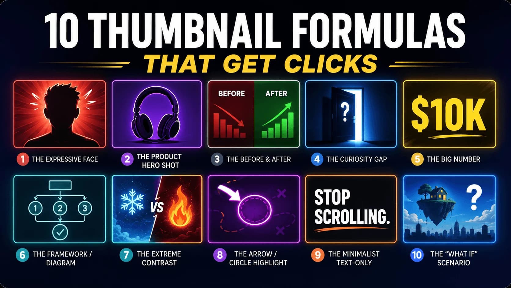
Most YouTube thumbnails fail because they are designed to look good — not to get clicked. A thumbnail that wins clicks follows a formula: a repeatable visual pattern that triggers curiosity, emotion, or urgency in under one second.
TL;DR: The highest-performing YouTube thumbnails follow specific, repeatable formulas — not random design choices. The 10 formulas below are used by top creators to consistently drive click-through rates (CTR) above the 5–10% range. Each formula combines a visual structure, a psychological trigger, and a mobile-first layout that works at thumbnail size.
This guide breaks down 10 proven thumbnail formulas used by the biggest creators on the platform. For each one, you will learn what the formula is, why it works psychologically, and how to apply it to your own videos.
Key Takeaways
- High-CTR thumbnails follow repeatable visual formulas, not random design.
- Thumbnails with human faces showing genuine emotion consistently outperform faceless designs.
- The best thumbnails use 3 words or fewer and work as a visual unit with the title.
- Complementary color contrast (blue/orange, yellow/purple) makes thumbnails pop against YouTube's interface.
- Always test your design at 120 pixels wide — that is how most viewers will see it on mobile.
What Makes a YouTube Thumbnail Formula Work?
A thumbnail formula is a repeatable visual structure that combines three elements:
- A visual pattern — the composition and layout of the image
- A psychological trigger — the emotion or curiosity it creates
- Mobile-first readability — legibility at tiny screen sizes (120–160 pixels wide)
The best formulas exploit how the human brain processes images: we notice faces before objects, contrast before detail, and emotion before logic. A great thumbnail hijacks this processing in under one second to force a pause in the viewer's scroll.
If you want to study how top creators apply these formulas, download their thumbnails using our YouTube Thumbnail Downloader and analyze them side by side.
Formula 1: The Expressive Face

What it is: A single human face showing a clear, strong emotion — shock, excitement, curiosity, or intensity — filling 40–60% of the frame.
Why it works: Human brains are hardwired to detect and process faces faster than any other visual element. An expressive face creates an instant emotional connection and makes the viewer wonder "what caused that reaction?"
How to use it:
- Fill the frame with the face — do not make it small in a corner
- The expression must be genuine and match the video content
- Direct the subject's gaze toward the key object or text in the thumbnail
- Use natural lighting and authentic skin tones — over-saturated "plastic" faces are losing effectiveness in 2026
Best for: Vlogs, reactions, challenges, storytime, commentary
Used by: MrBeast uses this formula on virtually every video, pairing exaggerated expressions with extreme scenarios. His thumbnails work because the face tells the entire emotional story at a glance.
Formula 2: The Product Hero Shot

What it is: A single product or object as the dominant visual element, photographed with studio-quality lighting against a clean, color-controlled background.
Why it works: When a viewer is searching for a product review or comparison, they want to see the product immediately. A clean hero shot signals authority, professionalism, and "this person actually has the product."
How to use it:
- One product, one background color, minimal text
- Use shallow depth of field or a solid-color backdrop to eliminate distractions
- Choose a single accent color that contrasts with YouTube's interface (avoid pure white or pure red)
- If comparing products, show both side by side with a clear "vs" divider
Best for: Tech reviews, product comparisons, unboxings, gear guides
Used by: MKBHD has mastered this formula. His thumbnails use premium product photography with a single saturated color accent, making each video feel like a magazine cover.
Formula 3: The Before & After

What it is: A split-screen or side-by-side comparison showing a clear transformation — old vs. new, bad vs. good, broken vs. fixed.
Why it works: Transformations create an instant curiosity gap: "How did they get from here to there?" The visual contrast between the two states tells a complete story without words.
How to use it:
- Place "before" on the left, "after" on the right (this matches natural reading direction)
- Use desaturated or muted tones for the "before" and vibrant, saturated colors for the "after"
- The contrast must be dramatic enough to be visible at mobile size
- Add a dividing line, arrow, or simple visual separator between the two states
Best for: Tutorials, room makeovers, fitness, skill progression, design, editing
Formula 4: The Curiosity Gap

What it is: An image that poses an unanswered question or shows an unexpected scenario. Something feels "off" or incomplete, and the viewer needs to click to resolve it.
Why it works: The curiosity gap is one of the strongest psychological drivers of clicks. The brain dislikes unresolved questions — it creates a tension that can only be relieved by watching the video.
How to use it:
- Show the setup but not the payoff (e.g., a person standing at the edge of something, a mysterious object, an impossible-looking result)
- Use 2–3 words of text that amplify the question, never answer it
- The title and thumbnail must work as a unit: the thumbnail shows the "what," the title hints at the "why"
- Never mislead — if the video does not deliver on the curiosity, viewers leave and your retention tanks
Best for: Experiments, science, exploration, mystery, storytelling
Used by: Veritasium pairs striking, "impossible-looking" imagery with almost no text. The thumbnail poses a scientific question so compelling that you have to click to find out the answer.
Formula 5: The Big Number

What it is: A large, bold number dominates the thumbnail — a dollar amount, a quantity, a time period, or a metric that signals scale or stakes.
Why it works: Numbers are concrete and specific. "$100,000" or "365 Days" creates an immediate sense of scale that vague statements cannot match. Large numbers in particular trigger the brain's "magnitude" response.
How to use it:
- Make the number the largest visual element in the thumbnail
- Use a bold, heavyweight font with high contrast against the background
- Pair the number with a face or relevant object for context
- Round numbers ($10,000) work for scale; specific numbers ($10,347) work for credibility
Best for: Challenges, experiments, finance, results-based content, milestones
Formula 6: The Framework / Diagram
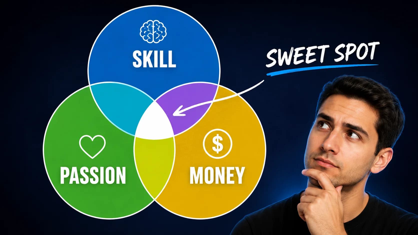
What it is: A clean visual framework — a Venn diagram, a simple chart, a numbered list, or a process flow — that promises an organized, actionable takeaway.
Why it works: Viewers looking for educational or how-to content want structure. A visual framework signals "this is organized, efficient, and will save you time." It sets the expectation of a clear, step-by-step payoff.
How to use it:
- Keep the diagram extremely simple — 3 circles, 4 boxes, or a basic flow
- Use 2–3 colors maximum
- The diagram must be readable at mobile size — if it requires zooming in, simplify it
- Pair with a face in the corner for human connection
Best for: Education, productivity, business, marketing, self-improvement
Used by: Ali Abdaal frequently uses framework compositions — Venn diagrams, before/after layouts, and clean diagrams that promise a clear transformation for the viewer.
Formula 7: The Extreme Contrast
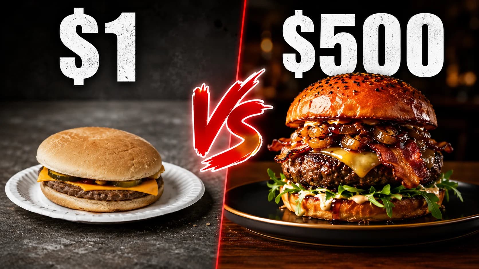
What it is: Two dramatically different things placed side by side — cheap vs. expensive, tiny vs. giant, amateur vs. professional — with visual emphasis on the difference.
Why it works: Extreme contrast creates instant visual interest and a natural narrative arc ("which one is better?"). The viewer wants to see the comparison play out.
How to use it:
- Use size, color saturation, or quality differences to make the contrast unmissable
- Label each side clearly ($1 vs $1,000, or Beginner vs Pro)
- Keep the layout symmetrical — equal visual weight on each side
- The comparison should be visible at thumbnail size without reading any text
Best for: Comparisons, taste tests, luxury vs. budget, skill levels, challenges
Formula 8: The Arrow or Circle Highlight

What it is: A bright arrow, circle, or highlight drawn on the image to direct attention to a specific detail the viewer might otherwise miss.
Why it works: Highlighting a specific detail implies "there is something important here that you need to see." It creates a treasure-hunt feeling — the viewer clicks to find out what the highlighted element means.
How to use it:
- Use a bright, contrasting color for the arrow/circle (red and yellow work best against most backgrounds)
- Point to something specific and interesting, not something obvious
- Do not overuse this formula — if every video has a red circle, it loses impact
- The highlighted element should be genuinely relevant to the video content
Best for: Mystery, discovery, analysis, reaction to specific moments, hidden details
Formula 9: The Minimalist Text-Only

What it is: A bold, eye-catching text statement on a clean background with no face, no product, and minimal imagery. The text itself is the entire visual hook.
Why it works: In a sea of busy, face-heavy thumbnails, a clean text-based design stands out through contrast with the surrounding content. The text makes a bold claim or asks a provocative question that demands attention.
How to use it:
- Maximum 3–5 words, preferably 3
- Use an extremely bold, heavyweight font (Impact, Bebas Neue, Anton)
- Choose a background color that contrasts with YouTube's interface (avoid white and red)
- The statement must be provocative, surprising, or contrarian — boring text kills this formula
- Add subtle texture or gradient to the background to avoid looking flat
Best for: Hot takes, announcements, thought leadership, opinion pieces, news commentary
Formula 10: The "What If" Scenario

What it is: A surreal, exaggerated, or impossible-looking scenario that could not exist in reality — prompting the viewer to wonder "is this real?" or "how is this possible?"
Why it works: The human brain cannot resist processing anomalies. When something looks wrong or impossible, the brain automatically tries to make sense of it — which creates a compulsive urge to click and find out.
How to use it:
- Use image editing to create a scenario that looks just barely believable
- The image should tell a story on its own without text
- Pair with a face showing a genuine reaction to the scenario
- The video must deliver on the premise — misleading thumbnails destroy channel trust
Best for: Experiments, science, challenges, creative projects, "what happens if" content
How to Choose the Right Formula for Your Video
Not every formula works for every video. Here is a quick decision guide:
| Your Content Type | Best Formulas |
|---|---|
| Vlogs & personal stories | Expressive Face, Curiosity Gap |
| Product reviews & tech | Product Hero Shot, Extreme Contrast |
| Tutorials & education | Framework/Diagram, Before & After |
| Challenges & experiments | Big Number, "What If" Scenario |
| Opinion & commentary | Minimalist Text, Curiosity Gap |
| Comparisons | Extreme Contrast, Before & After |
| Discovery & reaction | Arrow Highlight, Expressive Face |
Color Combinations That Drive Clicks
Regardless of which formula you use, your color choices matter. Here are the highest-performing color pairings for YouTube thumbnails:
| Color Combination | Best For | Why It Works |
|---|---|---|
| Yellow + Black | Gaming, Entertainment | Highest possible contrast; impossible to scroll past |
| Red + White | Action, News, Sports | High-energy, clean, and urgent |
| Blue + Orange | Tech, Education | Complementary pair; balances trust with warmth |
| Green + Gold | Finance, Results | Communicates success and growth |
| Purple + Yellow | Creative, Lifestyle | Unique and premium; rarely used by competitors |
Pro tip: Before finalizing your colors, check the top 10 search results for your topic. If every competitor uses blue, choosing orange makes you stand out.
The Mobile Readability Checklist
Every formula above must pass the mobile readability test. Before uploading, verify:
- ✅ Can you understand the thumbnail's story at 120 pixels wide?
- ✅ Is the main subject instantly identifiable?
- ✅ Can you read every word of text without squinting?
- ✅ Is the bottom-right corner free of critical elements (duration badge area)?
- ✅ Does it stand out visually against the surrounding thumbnails in search results?
For details on exact dimensions, safe zones, and file size limits, see our YouTube Thumbnail Size & Dimensions guide.
Study Real Thumbnails: Download & Analyze
The fastest way to improve your own thumbnails is to study what works for top creators in your niche. Here is a practical workflow:
- Find a top-performing channel in your niche
- Download their thumbnails using our YouTube Thumbnail Downloader
- For bulk analysis, use the Playlist Thumbnail Downloader to grab all thumbnails from a playlist at once
- Sort the downloaded thumbnails by which formula each one uses
- Note which formulas appear most often on their highest-view videos
- Adapt the winning formula to your own brand and style
FAQs
What is the best YouTube thumbnail formula for beginners?
The Expressive Face formula is the easiest starting point. It requires no graphic design skill — just a well-lit photo with a clear, strong expression. Pair it with 2–3 words of bold text and you have a high-CTR thumbnail.
How many words should a YouTube thumbnail have?
The best-performing thumbnails use 3 words or fewer. Research shows thumbnails with 4 or fewer words can achieve up to 30% higher click-through rates compared to text-heavy designs. If your image tells the story, you may not need text at all.
Should every thumbnail have a face?
No. While faces generally outperform faceless thumbnails, formulas like Product Hero Shot, Minimalist Text, and Framework/Diagram work extremely well without faces. Choose the formula that matches your content type.
How do I know which thumbnail formula works for my niche?
Download thumbnails from top creators in your niche using a thumbnail downloader and categorize them by formula. The formula that appears most often on high-view videos in your niche is likely your best starting point.
Can I use the same formula for every video?
You can, but variety helps prevent audience fatigue. Many successful creators rotate between 2–3 core formulas while maintaining consistent branding elements like fonts, colors, and style. Consistency in brand, variety in formula.